Information and user interface components must be presented to users in ways that are easily perceived and understood.
Accessibility
The State of Oklahoma is committed to delivering digital experiences that are usable to people with a diverse range of experiences.
ADA Guidelines
As part of our commitment to accessibility our site experiences are ADA complaint and adhere to usability guidelines for all our state constituents and site visitors. There are three levels of WCAG 2.0 guidelines:
Level A: the most basic level of compliance
Level AA: more thorough level to ensure for a more usable site
Level AAA: the highest level of compliance
The new Design System for the State of Oklahoma strives to adhere to ADA Level AA compliance standards and the following accessibility principles:
General Authoring Considerations
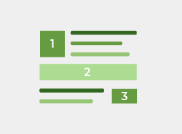
Hierarchy
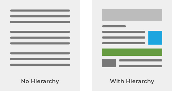
Hierarchy is a principle and technique that can aid in effective communication to site visitors. This includes visual hierarchy, navigation hierarchy, and information (or content) hierarchy.
Visual Hierarchy
Navigation Hierarchy
In order to help users understand which information is most important, we can use visual aids or textual cues. These can include color, text, iconography, shape, or motion. We should maintain consistency in these visual cues so that users remember upon return to the site. This will also help users to navigate to other state agency sites within the ecosystem that will leverage the same component library. This will provide visitors with a sense of muscle memory to perform tasks more accurately while avoiding potential frustration.
Information Hierarchy
Information hierarchy can be used to aid in the user’s learning journey. We want our users to move from raw data perception to wisdom, which is the highest level of information capture.
Every clickable element such as a button, image, and CTA adds complexity to the UI. In order to succinctly guide the user, consider these simple guidelines:
- Include clearly visible elements that stand out on the UI.
- Include enough contrast and adequate sizing (proportion) based on the element’s importance.
- Communicate hierarchy of importance, especially when requiring resolution, i.e.: fixing a field validation error.
- Information should be discernable at first glance.
- Placement: Include important actions, like an anchor link, near the top. Place less important information further down the page.
- Context: When necessary, provide relevant information next to an element for support or educational purposes. Examples of this are related articles or FAQs.
- Proximity: Position related items of a similar hierarchy next to one another in a similar visual treatment if they’re on equal level.
Groupings
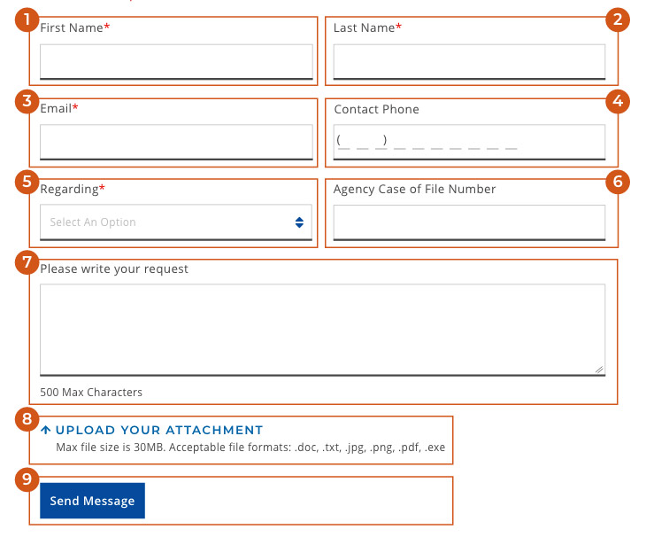
Consider grouping items together that are related to each other with a clear label. Labels should be succinct and on Brand with the State of Oklahoma messaging and tone guidelines. Groupings are also important when it comes to focusing order to increase ease of use and accessibility.
Focus order
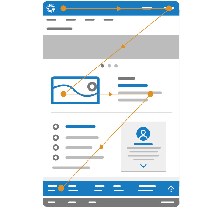
Focus order is the order in which a user recognizes the elements on a page. The visual layout of each page needs to take into account how the visual layout flows from the top to the bottom of the page to best communicate sequence of elements, importance, and relevance. It is best practice to organize a page so that the user focuses on the most important pieces of content first.
Color & Contrast
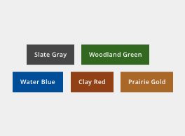
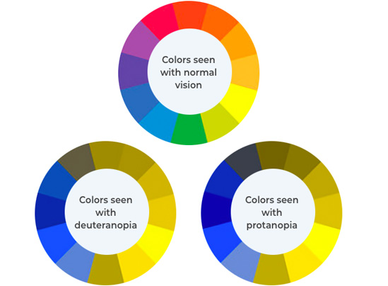
Color and contrast are basic tools that communicate emphasis, designate importance, and help users interpret content. From an accessibility perspective, color is one of the most important considerations to support users who see color differently or are unable to see color.
Color Principles
Color Blindness
Contrast Ratios
Contrast ratios represent how a color pairs against another color, commonly written as 1:1 or 21:1. The greater the difference is between the two numbers in the ratio, the greater the difference in relative luminance between the colors. The contrast ratio between a color and its background ranges from 1-21 based on its luminance (the intensity of light emitted) according to guidelines from the World Wide Web Consortium (W3C).
The higher the contrast, the better it is for users to distinguish between overlapping elements like text and non-text elements. For instance, a low-contrast image may be hard for some users to differentiate in bright or low light conditions, such as at night or a very sunny day. Also, consider monitors that may not be calibrated correctly and glare may also exacerbate the issue.
Visual Aids
Avoid relying strictly on color by including other design treatments to help ensure that color-blind users understand visual cues. Apply formal elements such as strokes (with enough thickness), visual indicators, patterns, texture, universal iconography, and/or text to describe actions, instructions, and content.
Color Check Tools
These color accessibility tools can be used to check color contrast ratios and ensure compliance to Level AA standards:
Color Contrast Checker | Google Material Color Tool
Plugins: Adobe XD | Sketch | Figma
This chrome plugin can be used to check color contrast ratios within the browser if for text on the gradient, solid, or image background.


